Brand Strategy
/
Brand Identity
/
YONY Tennis System
(
4
)

01
OVERVIEW
YONY Tennis is an apparel division of YONY built around a more refined expression of tennis culture. I created the identity and visual system to carry across product and campaign.
02
CHALLENGE
Tennis branding often leans either overly traditional or overtly athletic. The goal was to create something nostalgic and welcoming—refined, but never stuffy.
03
OUTCOME
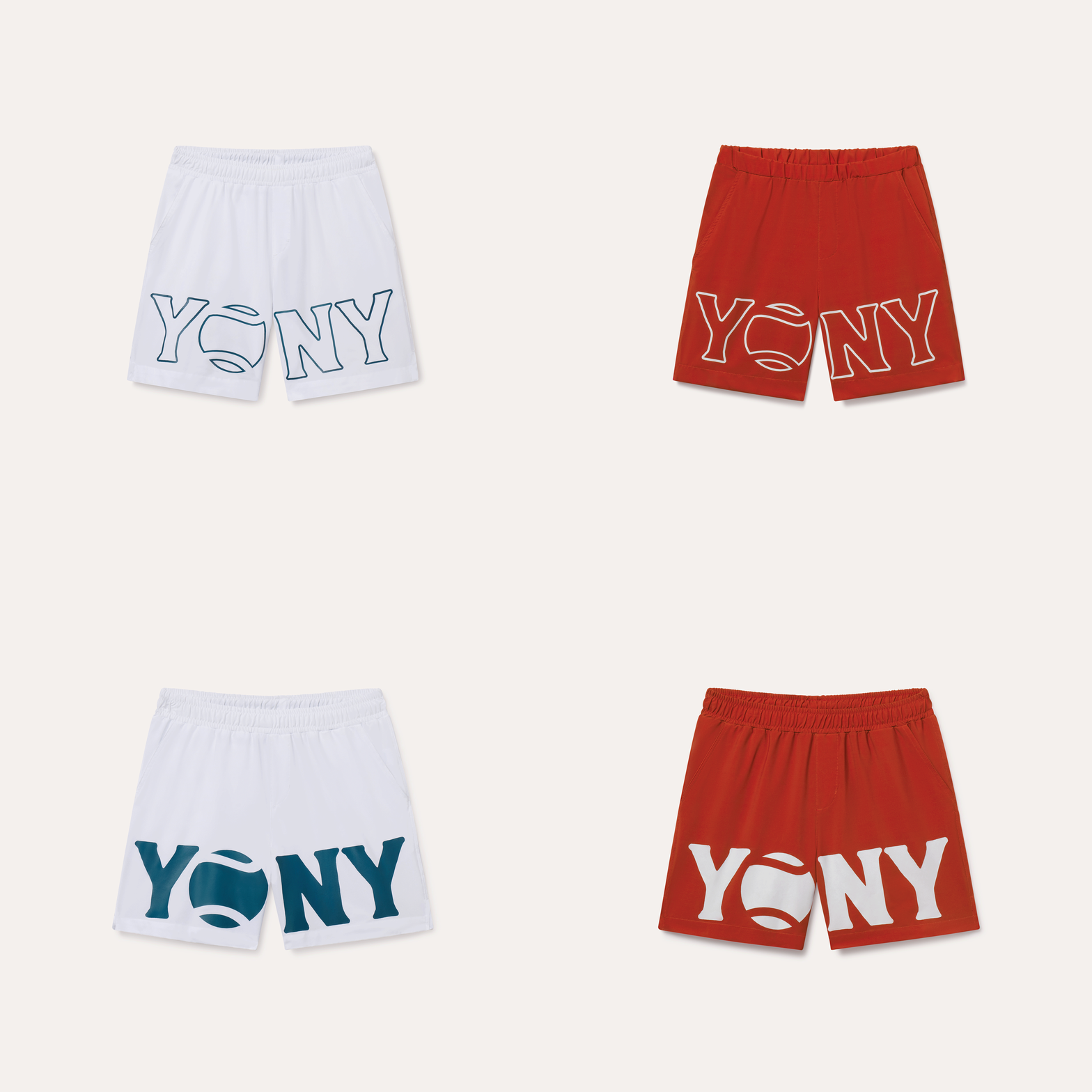
A flexible identity pairing the warm, vintage character of Larsim with a mark shaped by the curved seams of a tennis ball. The system was applied across apparel, graphics, and marketing campaigns.
WORDMARK SYSTEM
A FAMILIAR LINE, REFRAMED.
SOURCE FORM

FORM STUDY

SEAM STUDY

THE SYSTEM
PRIMARY WORDMARK

SECONDARY SEAL

MONOGRAM

BRAND FOUNDATIONS
COLOR PALETTE
Court Pine
#0E3A36
Signal Gold
#E3A429
Chalk Cream
#FBF7EC
Baseline Black
#111111
TYPOGRAPHY

APPLICATIONS



OTHER
PROJECTS


Get in touch